Mar 11, 2019 | Flooring America
A new year brings a new you, and an exciting new color trend. Design company Pantone recently announced “Living Coral” as its 2019 Color of the Year, a title the company has given out annually since 2000. According to Pantone’s official website, the vibrant pink hue was chosen for its “engaging nature,” “lively presence,” and ability to “provide comfort and buoyancy in our continually shifting environment.”
Balancing energy and excitement with warmth and sophistication, this “energizing,” marine-themed color has us thinking (peachy) pink for 2019. If you’re ready to ring in the New Year with a style overhaul, keep reading for simple tips on incorporating Pantone Living Coral into your home decor.
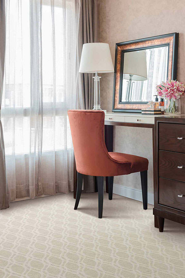
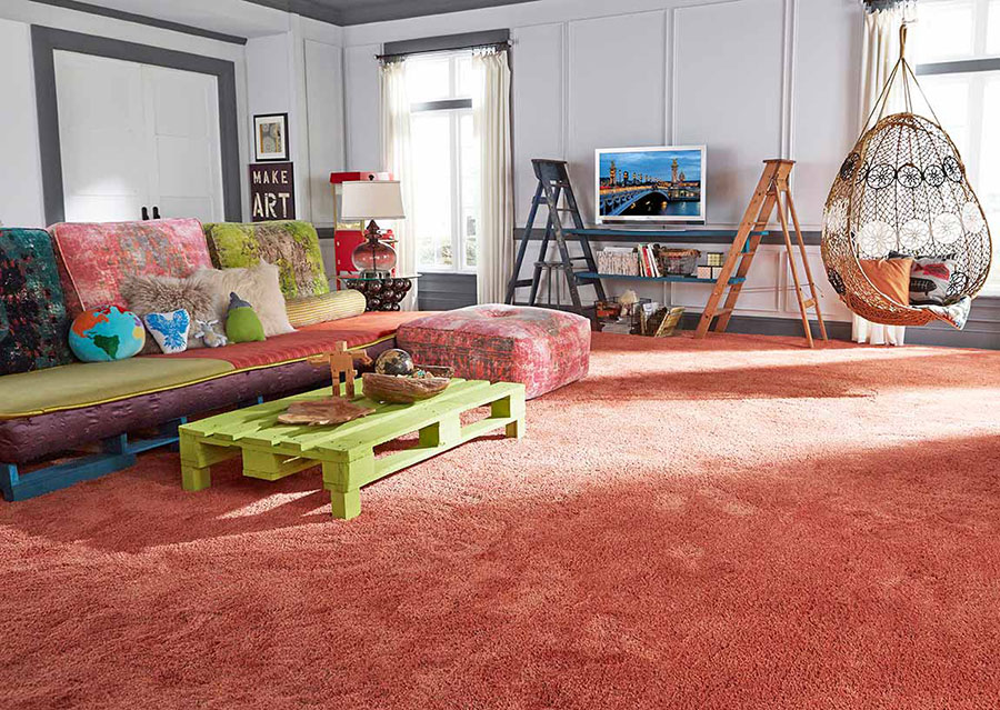
Color giant Pantone is a global tastemaker when it comes to fashion, design, and home decorating. That means the Pantone Color of the Year for 2019 influences all sorts of popular consumer brands and products, from fabric and upholstery to footwear and furniture. That makes it easy to incorporate splashes of coral or an orange-toned pink in any room of your home, giving your space color without feeling over-saturated. Simply choose a handful of pink accessories, and space them strategically throughout your home.
Need help thinking of ways to use coral accents? Some suggestions include accent rugs, end tables, decorative vases, paintings, flowers, or pillows. If working with a bathroom, you could experiment with incorporating soaps, hand towels, or shower curtains in this invigorating hue.
Every color corresponds with a “complementary,” or opposite, color. For example, if you were to look at a color wheel, you would see that red and green lie opposite each other, making them complementary colors.
If you kept looking at the wheel, you would also notice that red sits between orange and purple, while green sits between yellow and blue. When colors are next to each other on a color wheel, they are called “analogous” colors.
Similar to salmon, Living Coral is a deep pink that blends pastel notes with an electric quality.
To find a design scheme you love, try mixing and matching deep pink paint schemes or accents with complementary colors (like light green) or analogous colors (like magenta).
Coral isn’t just a color; it’s a physical object with form, texture, and shape. Keep the marine motif by “branching” out with decorative coral, which lends a whimsical yet sophisticated accent to any countertop, coffee table, or display case. Depending on the item’s size and seller, decorative coral pieces can cost as little as around $20.
If you’d prefer to avoid using real coral, you can make a handcrafted DIY version instead. There are countless online tutorials, which use materials like spray paint and paper maché pulp. (As an added bonus, not only does crafting save you money — it also doubles as a fun, creative way to spend an afternoon with the kids!)
You can also experiment with other beachy touches, such as nautical decor that incorporates shells, anchors, or rope. Our flooring experts can help you create a coastal beach house style to give your entire home that fresh, breezy feel.
Whoever said that 2019 color trends for your home had to be confined to paint schemes or decorations? Lighting is just as important when it comes to creating an atmosphere.
Keep that in mind when you approach your next home redecorating or remodeling project. For example, soft pink lamp shades can lend a soothing color tone to your bathroom or bedroom, perfect for relaxing and unwinding. Pink lights, such as Christmas lights or porch lights, can look especially elegant when combined with white or gold, ideal for parties and entertaining. (Just be careful to avoid any safety hazards!)
Pantone’s website referred to the “glorious, yet unfortunately more elusive, display beneath the sea” that coral creates in our oceans today. Pantone also pointed out that our environment is “continually shifting.”
In an era of increasing environmental awareness, many consumers want to make eco-friendly design choices, but don’t always know where to get started. Repurposing old decorations or pieces of furniture can be a chic and cost-efficient way to spruce up your space with new looks for less. A fresh pink coat of paint could transform that unwanted old chair or dresser into your favorite new centerpiece.
Looking for inspiration? Then check out some of Pantone’s previous Color of the Year winners, which include Ultra Violet (2018), Greenery (2017), Rose Quartz (2016), Serenity (2015), and Marsala (2014).
We hope these tips have given you some helpful insights into decorating colors for 2019 and ways to bring them into your space successfully. At Flooring America, our friendly experts go above and beyond to help your family find just the right “look,” whether it’s for your bathroom, your bedroom, your kitchen, or all of the above.
Let us help you in person at one of our conveniently located stores. Contact us online, or call Flooring America at (877) 297-8428 to get started today.